On 1 June 1999 Neil and Sharon launched Howdy.
During those 15 years we have had the pleasure of working with many great clients and staff and we would like to thank them all for their support. Throughout June we’re going to be showcasing some of the great work that we’ve produced during that time so we hope you’ll enjoy our nostalgic trip down memory lane and check out our daily updates.

We moved into our freshly painted studio in Battersea and are still here today.
1999
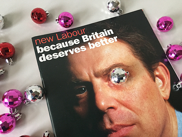
 Working on the Labour Party Centennial Report was particularly interesting as we researched and sourced all the archive material for inclusion in the report looking back over the past 100 years. We also directed a photoshoot with Tony Blair at Downing Street.
 We worked with Camron PR on the design and branding for the Marks & Spencer, ‘Time to Celebrate’ roadshow celebrating the millennium. The Show travelled to different stores around the country showcasing products as well as featuring catwalks, food demonstrations and workshops. We produced signage, brochures, carrier bags and promotional materials for the event.
2000
 So 2000 was upon us – the world hadn’t come to an end and our computers hadn’t ground to a halt – and we did the new corporate identity (as they were known in those days) and identity guidelines for the film company, United International Pictures, dragging their brutal dated 70’s logo into the noughties.

It was the dot com boom and we produced this identity for dig-it.co.uk, an online gardening company and implemented it across the website, marketing materials, ads, packaging and catalogues.
2001

We gave this Annual Report and Accounts for Christian Aid a magazine style showcasing the great pictures from their picture library.


In 2001 Reuters launched Kalends, a service that provided notice of future events covering finance, sports, society, conferences and market/public holidays aimed at business customers. Howdy designed their website and office interiors, promotional materials including advertising and Christmas cards.
2002

We designed this press pack promoting the Design Council’s Design Against Crime campaign. A set of case study sheets were sent out in an ‘evidence’ bag. We directed the photoshoots for the project and the photographer even smashed his own car window for one shot. Now that’s dedication!
 The prints for these Black & Decker seasonal press packs were made using grass, leaves and flowers from our own gardens.
2003
We designed this exhibition for the Reuters Journalist of the Year awards ceremony showcasing the finalists.
 This brochure for Ulster Carpets was to promote their custom made carpet service.
2004
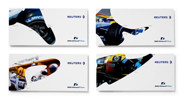 These materials promoting Reuters’ Formula 1 sponsorship were based on the layouts of each F1 circuit.
 This ‘talking’ logo for VegaStream had a warm friendly feel to introduce VoIP to a wider consumer audience rather than just business users.
2005
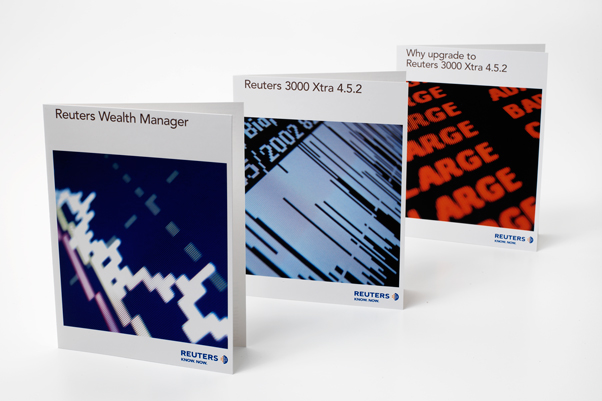
 We redesigned the promotional literature for all Reuters products and produced extensive design guidelines and templates for implementation.
 We designed the identities for four Christian Aid Week campaigns from 2001-05. We implemented the designs across a wide range of materials in English and Welsh including posters, worship materials, information leaflets, collection envelopes and schools resources.
2006
 This identity for food and drink PR specialists, Phipps, used playful food references chosen by each member of staff on the reverse of business cards as headlines.
 We produced this identity for GuildHE following a name change. They campaign for distinction and diversity in Higher Education.
2007
 A strong professional identity for executive search organisation, Hoggett Bowers.
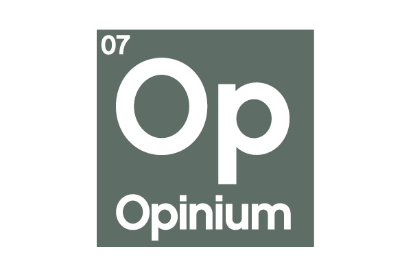
 This clean and simple identity for research company, Opinium, used a visual play on the periodic table reflecting their strapline, ‘the pure element of opinion’.
 This trade catalogue for sports manufacturer, Mitre, focussed on grass roots sport and we directed the mood photography around that theme, as well as directing the product photography of over 300 boots, balls and accessories.
2008
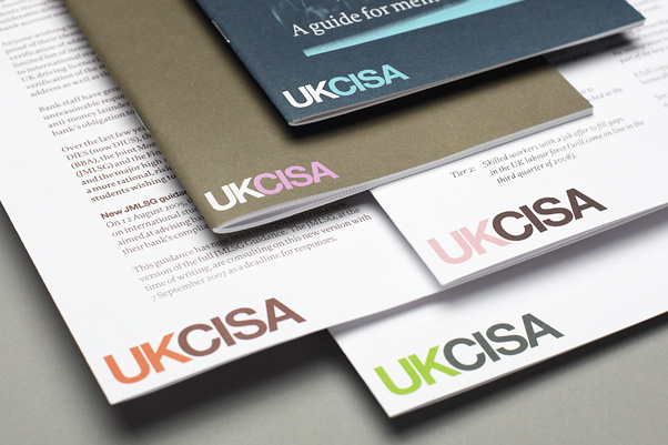
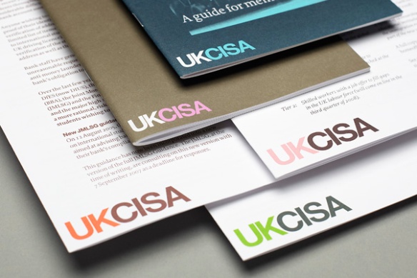 UKCISA is the UK’s national advisory body serving the interests of international students and those who work with them. Our brief was to develop the logotype and branding to unify all publications and electronic media. We produced templates and guidelines so that all materials could be produced inhouse.
 We first starting working with Green Alliance in 2008 and they are still a great client of ours today. One of the first projects that we did for them was to review and develop their identity and design guidelines developing a colour palette for each of their six work themes.
2009
 This identity and branding project began with email and telephone research among IFF’s existing, lapsed and target clients, and staff workshops, to build a clear picture of IFF’s position within the marketplace and any barriers preventing their future growth. This formed the basis of the design brief.
 We designed this book – Window On Teens (WoT) – for marketeers about teenagers based on extensive research conducted by Lowe Advertising. The pictures were all supplied by the teenage participants.
2010
 We designed this identity and design guidelines for the trade association, Combined Heat and Power Association to help shift the name towards CHPA following a shift of membership to include other sustainable industry and district heating providers.
 We designed this identity for a range of site tools and anciliaries for the building and construction industry. The brief called for an identity that shouts ‘strong, tough and reliable’.
 We produced the identity and brand guidelines for St Martin-in-the Fields church in Trafalgar Square. The logo was based on the story of St Martin cutting his red cloak in two and giving half to a poor beggar on a snowy night. The logo launched at a special service on St Martin’s day and featured a hymn specially written about the new brand. The identity received a Highly Commended in the Third Sector Excellence Awards beaten by our identity for the QNI featured below.
 The Queen’s Nursing Institute is a charity dedicated to improving the nursing care of people within their own homes. They wanted a new modern and distinctive identity to engage a wider audience beyond the nursing community following a shift in mission and focus. This won best brand in the Third Sector Excellence Awards.
 This droplet logo for Lifehouse – a spa in Thorpe-le-Soken, Essex – reflected both the beautiful gardens and lake as well as the significance of water within the spa. The droplets were then also used in a fun illustrative way throughout the signage and across the communications. Further examples of this can be seen on our website at http://www.howdy-pardners.com/portfolio_identity_lifehouse.php
2011
 This marketing campaign for the Royal Free London NHS Foundation Trust was to promote their sexual health clinic, primarily to a younger audience. It appeared on buses, bus stops, tube posters and in doctors surgeries.

We have been working with London Business Forum since 2003 designing a wide range of marketing materials for them promoting their business events. In 2011 we redesigned their website. You can see more examples of our work for LBF at http://www.howdy-pardners.com/portfolio_print_lbf.php
2012
 To celebrate their tenth birthday, the independent think tank, Reform produced this collection of essays. You can see more of our work for Reform at http://www.howdy-pardners.com/portfolio_print_reform.php
 We produced this identity for the independent legal research institute, British Institute for International and Comparative Law (BIICL), and associate organisation, Bingham Centre for the Rule of Law delivering design guidelines and templates for inhouse implementation across all print materials. We designed all templates for the website http://www.biicl.org/
2013
 We turn the raw data from Green Alliance research into infographics to help convey their research in a more immediate and engaging way. These work well both in printed form and online but are also extremely successful for use across social media.
2014
 We worked with UCLH NHS Foundation Trust to create a unified brand that was implemented across all their communications, including phone and tablet apps.
If you liked it please share it: