That’ll be £100,000 please

I recently listened to a podcast of my childhood hero, Pete Townshend, delivering his John Peel lecture on how creativity (in music) has been devalued by the growth in free music downloads. Pete’s beef was that, while lawyers, plumbers, pilots, cleaners and accountants get paid as the clock ticks, ‘creativity has less value than an hour’s work by me as a musician’. The comparison with design isn’t perfect (artwork vs ideas?), as musicians are self motivated artists rather than commissioned ‘professionals’, but the comparison does hold true when it comes to the difficulty we have in putting a value on creativity.

As designers we’re commissioned by small companies, global corporations, charities and individuals, so the value of a great idea to each of these types of client can vary hugely.

We’re currently working on a small project for a sole trader IT specialist. His brand identity will help him communicate his personality and professionalism and will be of huge value to his embryonic business. Ideas may come easy, it may be a tortuous process or inspiration may strike in the middle of the night (it sometimes does). However, having worked on countless identity projects the one thing I can absolutely guarantee is that this project, and the way the creative process develops, will be unique.

One man who had no problem in putting a price on his creativity was Paul Rand (designer of The IBM logo, amongst others) who, when asked to present some design options by Steve Jobs for his new computer business Next said “I will solve your problem and you will pay me. You can use what I produce or not, but I will not do options, and either way you will pay me.” (It would cost $100,000). If I had the ego and arrogance to say that to a client I’d be shown the door, and rightly so. I think that today even a legend like Rand would be out on his ear. Branding is a collaborative process and no designer would expect his client to have zero input into the visual identity of his own brand.

Maybe branding should be an even more collaborative process. If we find it difficult to put a value on creativity maybe more of us could share some of the risk by taking a reduced up-front fee, but charging a ‘royalty’ that’s linked to the clients’ (hopefully) growing profits. This seems to make sense as the value of a brand identity only becomes apparent over time. The problem there is that it takes a lot more than a brilliant piece of graphic design to ensure a company’s success. Management, advertising, PR, quality of product/service, quality of staff, to name just a few, all contribute to the success of a ‘brand’, so we’re still left with the same ‘how much is it worth’ conundrum.

Would it be easier for us, and for our clients, if we simply charged an hourly rate for a transparent process that ran from research and strategic planning, through to implementation and evaluation? The bigger the project, the longer the hours, the bigger the fee. But while the strategic and implementation phases of a branding project can be planned, managed, controlled, estimated and scheduled, that spark of creativity and invention around which any successful design project hinges can still be so slippery and elusive.

So how do we measure the effectiveness of a brand identity so that a client may better value it? Maybe the modern way would be to get the public to vote on it. Do an X factor. Throw your logo to the dogs. In fact, I can remember a new British Airways identity being killed off by the people (and Maggie Thatcher’s handkerchief), and that was pre-internet! And we all know the fate of the new Gap logo when the Twittersphere got its talons on it.

Should it be as simple as measuring sales and awareness before and after a redesign? A rebrand is often only the visual manifestation of more fundamental changes within an organisation, so it would be equally wrong for a new identity to take the credit or the blame for an organisation’s success or failure. What if we’re branding a new organisation or product? What do we measure against?

So where does that leave us? Don’t ask me. But I think at Howdy we’ll carry on as we are at the moment: discussing a client’s needs, expectations and budget limitations and submitting an honest and fair estimate of how much we think he should pay for our work. We won’t be taking Paul Rand’s stance any time soon: “I know best, I’m a designer, and I’ve been doing this for over 30 years. Oh, and it’ll cost you £100,000.”

What type of client are you?

By Neil Smith

Over the past 30 years, 15 of them as Howdy, I have worked for a diverse range of clients, from incontinence pad manufacturers to major banks. I’ve visited laboratories in Germany and international news agencies in New York, I’ve had meetings at 10 Downing Street and in offices above kebab shops in Finchley. This experience has enabled me, very unscientifically, to identify a number of client types. Obviously I haven’t bothered with the ‘friendly’, ‘efficient’ and ‘reasonable’ clients, as I couldn’t think of anything funny to say about them. New clients are very hard to come by, and we’d be happy to work with any of the following client types. And I’d just like to add that at Howdy we love all our clients, especially our current ones, most of whom fall into the final category.

The well informed client
Not to be confused with the client who thinks they know it all, this client actually does. One particular client’s knowledge of typography, design history and print technology put us to shame. She took a sadistic pleasure in getting us to re-kern lines of text with a scalpel often late into the night (this was pre- Macintosh) and was an intimidating presence whenever she visited the studio. We produced some of our best work for this client.

The randy client
This group of clients doesn’t exist, until you give them alcohol. You’re more likely to encounter this client at a Christmas party or a company launch than in the board room. I encountered one at a party as a young designer, and felt terror and confusion in equal measure as the company’s biggest client tore my favourite shirt off my back and ran her clammy drunk hands across my naked chest. I think she might have even snarled a playful ‘Grrrrrr’ in the process. It still sends shivers down my spine after all these years. I’ve blanked the rest from my memory.

The ‘more is more’ client
This client doesn’t really get Swiss typography or Nordic minimalism. They’d rather buy design by the square metre. A client once phoned and asked if they could have a ‘bit more design’ on the cover of their insurance policy document cover. We argued that the white space was working as hard as the text and imagery. They didn’t buy it.

The deluded entrepreneur
The most troublesome of the client groups. They lure you in with promises of fame and riches, of shares in their new Google / new Amazon / new Starbucks venture (delete where applicable). You commit totally, you submit to their infectious passion and before long you are an enthusiastic ambassador, telling anyone who will listen that this is the next big thing and that by this time next year you’ll be sunning yourself in the Bahamas. Then you get the phone call: ‘The backers have pulled out’ or ‘We have patent issues’. Six months (unpaid) work down the pan and you swear you’ll never be seduced again. The phone rings… ‘Hi, we’ve got this idea for a new range of oxygenated fruit drinks’… ‘Great, when do we start!’.

The ‘more money than sense’ client
Not sure that this ‘type’ exists outside the 1980s. We once worked for a City chap who was setting up his own trading firm. After briefing us on his branding project he took us to his basement to show us his Ferraris (yes, that’s plural). We figured that this gentleman would be happier paying over the odds for this design work so that he could brag to his chums about how much he’d spent on his new logo. Our hunch paid off, our client was as happy as Larry with the estimate and with the finished project, and we were able to fund an extension to our studio Scalextric track (well, this was the eighties).

The ‘design is for girls’ client
Thankfully not so common these days. We presented to the Chairman of a large textile company and his board of directors, who seemed preoccupied by our funny haircuts and blouson jackets. At the end of the presentation the Chairman seemed slightly non-plussed, saying that he thought he liked it, but he would have to show his wife before he could make a decision. We also encountered the following, from a CEO at another presentation: ‘Purple? it can’t be purple – my wife hates purple!’.

The ‘I’ll know what I want when I see it’ client
The presentation went well, everyone’s happy and excited then suddenly you find yourself producing endless variations and colour combinations of the ‘approved’ design because, apparently, its not quite right. The client can’t quite put their finger on what they don’t like, but of course ‘They’ll know what they want when they see it’. These projects can seem infinitely long, but unfortunately not infinitely well paid.

The frustrated designer
The only reason this client doesn’t design it themselves is because they don’t have the time or the software (or the talent). Ideally they’d like to sit next to you listening to your Smiths CDs, drinking espressos and offering handy suggestions on what typeface to use.

The ‘play it safe’ client
This is the client whose logo and pithy strap line gradually morphs into a Novella as they desperately try to keep their bosses and ‘stakeholders’ happy.

The bad driver
You’re collected from a rural railway station and driven at terrifying speeds, in an executive saloon, through narrow lanes to an out of town business park. I’m not sure, but they seem to be saying ‘I’m the client, i’m in control, and I’m going to drive really, really fast and scare the shit out of your trendy, fixed wheel riding, London arse’, or something.

The perfect client
This client is a careful driver. But more importantly, they’re open to ideas and trust your skills and advice as a designer. They provide a comprehensive brief, or enough information for you to be able to write the brief with them. They have an understanding and appreciation of the benefits of design, a realistic budget and realistic expectations. They also don’t leave things to the last minute. They’re pleasant and friendly to work with. That’s about 10 points I reckon. If a client can fulfil six or more of these, I think they’re pretty perfect.

Here we are having fun with some of our perfect clients
Here we are having fun with some of our perfect clients having just won an award for the great annual report we did for them.  

Design trends – how much should they influence branding decisions?

It’s the time of year when annual trend forecasts are published and magazines are full of news on what colours and shapes are ‘in’ and what will dictate 2016’s ‘style’.

This year Pantone have selected two ‘colours of the year’: Rose Quartz and Serenity. According to Pantone’s Executive Director, Leatrice Eiseman: “These colours demonstrate an inherent balance between a warmer embracing rose tone and the cooler tranquil blue, reflecting connection and wellness as well as a soothing sense of order and peace.”
What does this mean to us, as branding and communications specialists, in our day to day marketing and design decisions? Probably not a lot in all honesty. Identity and communication design needs to reflect, enhance and communicate a brand and its values on a longer term basis.

Fast changing trends are essential in fashion, an industry built around seasonal, short term collections fuelling our desire to update our wardrobes every few months, but it’s no accident that most fashion brands’ corporate identities are black and white or neutral, giving them the flexibility to work with and sit above each season’s changing trends. Brands like Chanel, Burberry, YSL, Gucci and Fred Perry, are iconic and have changed very little, if at all, in the past 20+ years, maintaining consistent, well managed and instantly recognisable brand identities.

A brand identity is not a short term investment and, as such, should not be subject to seasonal whims and fancies. Longer term trends do occur and brand identities can become tired and outdated and in need of a revamp, but this should be after years not months.

The key to a successful and long lasting corporate identity is to get the brief right and find a design partner you feel is right for you (see our blog ‘Choosing the right design partner’).

Ensure you end up with an identity that accurately reflects your brand values and personality. Be ambitious and look to the future. Think about where you want the organisation to be in five years and aim for an identity that reflects that vision. Don’t be swayed by this season’s style ‘must haves’. Don’t end up with a logo that’s ‘so last season’ in 12 months time.


Howdy Christmas Charity Emporium

Howdy’s 2014 has been notable for two major events, one good, one not so good. We celebrated our fifteenth birthday this year, which was good – and Howdy partner, Sharon, was diagnosed with Epilepsy, which is not so good, although she sometimes refers to it as Leprosy*, which would’ve been worse.

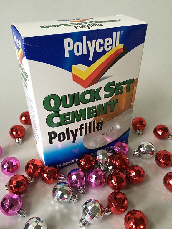
So, we’ve decided to clear out 15 years worth of junk, flog it on Ebay and donate the cash to the Epilepsy Society. This also gives you the opportunity to bag some unique gifts, like a 15 year old packet of quick drying cement, a nearly-complete roll of Police incident tape or a copy of Labour’s 1997 Manifesto (which we helped design).

boiler_suit_SOLD

Boiler suit, Large, used
The last time this was worn was 15 years ago by Neil, when we painted our studio and it’s never been washed! Ideal gift for someone who may wish to give the impression (to a new partner, for instance) of being a somewhat messy decorator or an abstract impressionist painter.
Sold for £14.50

creative_review SOLD

Set of 11 Creative Reviews from 2000, used
Design/Advertising journals including features on: Peter Saville, Designers’ Republic, Pentagram, Martin Parr and many more.
Sold for £2.99

Police_tape_SOLD

Roll of Police Incident tape, partially used
We acquired this for a Design Council, Design Against Crime project. Could be used for guaranteeing a parking space outside your house, or for reserving a spot on a crowded beach, for instance.
Sold for £1.45

Eurotape

Eurotape 500 metres
This is ‘The world’s best barrier tape bar none’. Handy if you have a large crowd to marshall, or a sink hole to cordon off.
Sadly this didn’t sell!

Quick set cement

Quick setting cement 2kg (nearly), opened
No idea why this is in the cupboard, but it’s an ideal gift for anyone who needs to repair any masonry surface – even underwater, according to the packet. Small amount used.
Amazingly this didn’t sell so contact us privately to negotiate a good price.

Don_McCullin_SOLD
‘Cold Heaven’ exhibition catalogue signed by Don McCullin
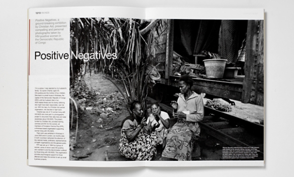
A catalogue for the exhibition of Don McCullin’s photographs of the AIDs crisis in Africa. Designed by Howdy and commissioned by Christian Aid.
Sold for £25.00

Labour_manifesto1997 Labour Party Manifesto
Bag this historic political document. Howdy partners, Neil and Sharon, were part of the team that produced this document at Millbank Tower in 1997.
Sold for £1.99 

cables

Cambridge Audio Atlantic interconnect cable
Whether you’re listening to Slade or Handel this Christmas, this interconnect will make your stereo sound fab.
Sold for £6.00

Door_closer_ribbon

Spring door closers, unused
As it says on the pack, this is ‘The best way to close any door’. Despite the deceptive name, it’ll close doors all year round too.
Sold for £5.51

Speaker_mounts

AVF Speaker Wall Mounts, boxed, unused
We can’t think of a more perfect gift for someone who needs to mount their speakers on the wall.
Sold for £7.55

printer_3

Epson Stylus Pro 4000 inkjet A2 printer
We bought this for producing high quality printed presentations. These days we tend to project from PDF files and as a consequence this printer has sat idle for the past 2-3 years resulting in clogged nozzles. These will need cleaning or replacing. It comes with a selection of paper rolls too.
Sold for £155.00

grip_seal1

100 Grip Seal bags, new
It’s gripped, it’s sorted, let’s off-road!
These remain unsold – anyone wanting any grip seal bags please get in touch – we have a lot!!!!

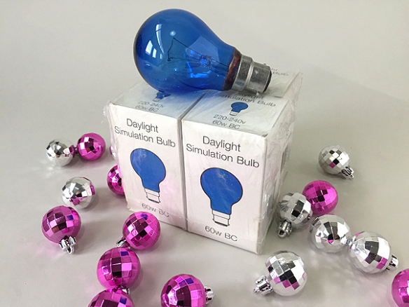
Bulbs

4 x 60w daylight simulation light bulbs
Ideal for confusing moths. (Not recommended for vampires or badgers.}
Relisted so you can still snap these up – bid here.

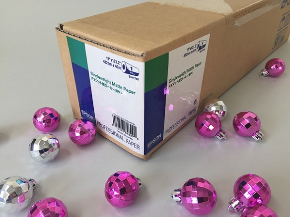
Singleweight_matt_paper

Unopened box Singleweight Matte printer paper
From back in the days when we ordered in bulk, yet more excess stock, no longer required given we’re selling the printer – see above.
Sold for £5.60

heat_lamp

Philips InfraPhil infrared heat lamp
Sore leg? Ingrowing toenail? Egg-bound? Buy this heat lamp – it’ll cure the lot.
Sold for £1.20

playing_cards

‘Greek lovers’ playing cards
Whist drive a little listless? Take inspiration from these pornographic playing cards and turn it into a full-blown Tuesday morning greek-style orgy.
Sold for £9.45

Maracas

Maracas
We’ve no idea where these came from, but we found them in a magazine holder. Great balance and rich tone. Ideal for beginner to intermediate level maracas players.
Sold for 99p

laptop

G4 Powerbook
Our trusty ten year old Powerbook. It’s a bit dented and the Apple key is wobbly, but it still works and comes with the original system installer disks and charger cable.
Sold for £39.89

Sales currently total: £449.31 (updated 4.30pm 5 January 2015)

Some people have very generously expressed an interest in making a donation to the Epilepsy Society without having to buy any of our old tat – hard to believe I know. Consequently we have set up a Just Giving page so please click here if you would like to make a donation.
Donations currently total: £200.00 (updated4.30pm 5 January 2015)

*An unexpected side effect of Sharon’s epilepsy is that she frequently mixes her words up, often to humorous effect.

Howdy celebrates 15 years

On 1 June 1999 Neil and Sharon launched Howdy.

During those 15 years we have had the pleasure of working with many great clients and staff and we would like to thank them all for their support. Throughout June we’re going to be showcasing some of the great work that we’ve produced during that time so we hope you’ll enjoy our nostalgic trip down memory lane and check out our daily updates.

Howdy

We moved into our freshly painted studio in Battersea and are still here today.

1999

Labour Party ARWorking on the Labour Party Centennial Report was particularly interesting as we researched and sourced all the archive material for inclusion in the report looking back over the past 100 years. We also directed a photoshoot with Tony Blair at Downing Street.

M&S ShowWe worked with Camron PR on the design and branding for the Marks & Spencer, ‘Time to Celebrate’ roadshow celebrating the millennium. The Show travelled to different stores around the country showcasing products as well as featuring catwalks, food demonstrations and workshops. We produced signage, brochures, carrier bags and promotional materials for the event.

2000

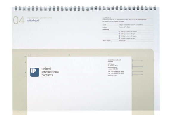
UIP_GuidelinesSo 2000 was upon us – the world hadn’t come to an end and our computers hadn’t ground to a halt – and we did the new corporate identity (as they were known in those days) and identity guidelines for the film company, United International Pictures, dragging their brutal dated 70’s logo into the noughties.

It was the dot com boom and we produced this identity for dig-it.co.uk, an online gardening company and implemented it across the website, marketing materials, ads, packaging and catalogues.

2001

CA_Annual-Report

We gave this Annual Report and Accounts for Christian Aid a magazine style showcasing the great pictures from their picture library.

Kalends_website

In 2001 Reuters launched Kalends, a service that provided notice of future events covering finance, sports, society, conferences and market/public holidays aimed at business customers. Howdy designed their website and office interiors, promotional materials including advertising and Christmas cards.

2002

We designed this press pack promoting the Design Council’s Design Against Crime campaign. A set of case study sheets were sent out in an ‘evidence’ bag. We directed the photoshoots for the project and the photographer even smashed his own car window for one shot. Now that’s dedication!

The prints for these Black & Decker seasonal press packs were made using grass, leaves and flowers from our own gardens.

2003Reuters

We designed this exhibition for the Reuters Journalist of the Year awards ceremony showcasing the finalists.

This brochure for Ulster Carpets was to promote their custom made carpet service.

2004

#2 001These materials promoting Reuters’ Formula 1 sponsorship were based on the layouts of each F1 circuit.

Vega_cardsThis ‘talking’ logo for VegaStream had a warm friendly feel to introduce VoIP to a wider consumer audience rather than just business users.

2005

Reuters-LiteratureWe redesigned the promotional literature for all Reuters products and produced extensive design guidelines and templates for implementation.

#8a 001We designed the identities for four Christian Aid Week campaigns from 2001-05. We implemented the designs across a wide range of materials in English and Welsh including posters, worship materials, information leaflets, collection envelopes and schools resources.

2006

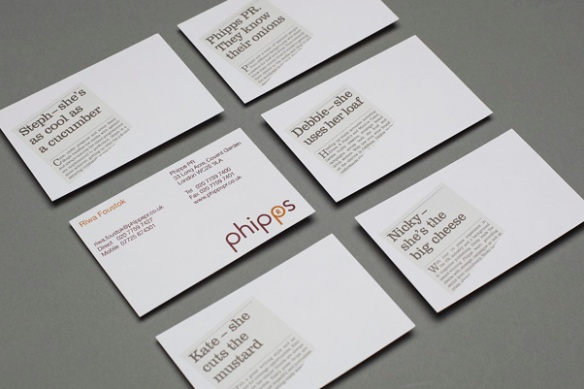
howdy_folio 0188This identity for food and drink PR specialists, Phipps, used playful food references chosen by each member of staff on the reverse of business cards as headlines.

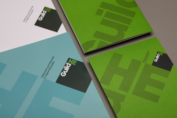
howdy_folio2 0002We produced this identity for GuildHE following a name change. They campaign for distinction and diversity in Higher Education.

2007

/Users/ranaldmac/Desktop/howdy_folio2/Output/.howdy_folio2 0011.tifA strong professional identity for executive search organisation, Hoggett Bowers.

OpiniumThis clean and simple identity for research company, Opinium, used a visual play on the periodic table reflecting their strapline, ‘the pure element of opinion’.

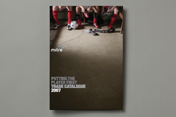
MitreThis trade catalogue for sports manufacturer, Mitre, focussed on grass roots sport and we directed the mood photography around that theme, as well as directing the product photography of over 300 boots, balls and accessories.

2008

howdy_folio 0152 UKCISA is the UK’s national advisory body serving the interests of international students and those who work with them. Our brief was to develop the logotype and branding to unify all publications and electronic media. We produced templates and guidelines so that all materials could be produced inhouse.

GA_GuidelinesWe first starting working with Green Alliance in 2008 and they are still a great client of ours today. One of the first projects that we did for them was to review and develop their identity and design guidelines developing a colour palette for each of their six work themes.

2009

IFF-LogoThis identity and branding project began with email and telephone research among IFF’s existing, lapsed and target clients, and staff workshops, to build a clear picture of IFF’s position within the marketplace and any barriers preventing their future growth. This formed the basis of the design brief.

wot_4We designed this book – Window On Teens (WoT) – for marketeers about teenagers based on extensive research conducted by Lowe Advertising. The pictures were all supplied by the teenage participants.

2010

CHPA LogoWe designed this identity and design guidelines for the trade association, Combined Heat and Power Association to help shift the name towards CHPA following a shift of membership to include other sustainable industry and district heating providers.

DUCO_clothingWe designed this identity for a range of site tools and anciliaries for the building and construction industry. The brief called for an identity that shouts ‘strong, tough and reliable’.

smitf_wall_3We produced the identity and brand guidelines for St Martin-in-the Fields church in Trafalgar Square. The logo was based on the story of St Martin cutting his red cloak in two and giving half to a poor beggar on a snowy night. The logo launched at a special service on St Martin’s day and featured a hymn specially written about the new brand. The identity received a Highly Commended in the Third Sector Excellence Awards beaten by our identity for the QNI featured below.

Qni_guidelinesThe Queen’s Nursing Institute is a charity dedicated to improving the nursing care of people within their own homes. They wanted a new modern and distinctive identity to  engage a wider audience beyond the nursing community following a shift in mission and focus. This won best brand in the Third Sector Excellence Awards.

lifehouse_bagThis droplet logo for Lifehouse – a spa in Thorpe-le-Soken, Essex – reflected both the beautiful gardens and lake as well as the significance of water within the spa. The droplets were then also used in a fun illustrative way throughout the signage and across the communications. Further examples of this can be seen on our website at http://www.howdy-pardners.com/portfolio_identity_lifehouse.php

2011

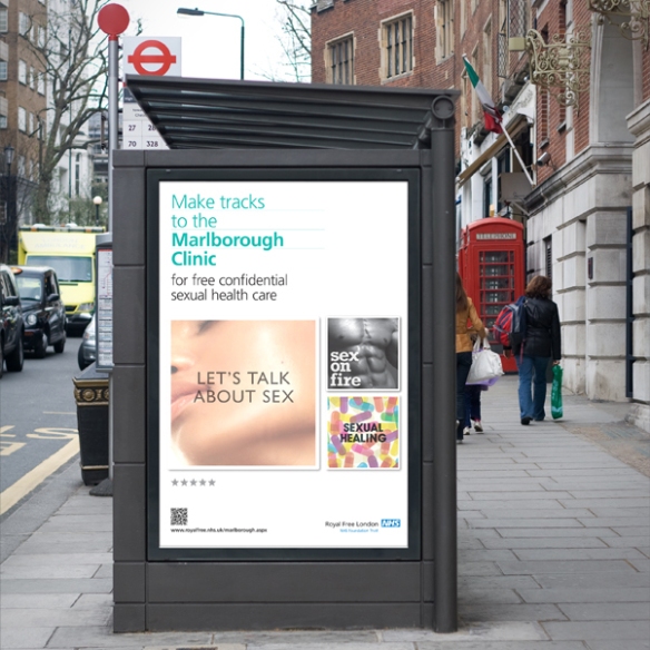
Marlborough clinicThis marketing campaign for the Royal Free London NHS Foundation Trust was to promote their sexual health clinic, primarily to a younger audience. It appeared on buses, bus stops, tube posters and in doctors surgeries.

LBF_1

We have been working with London Business Forum since 2003 designing a wide range of marketing materials for them promoting their business events. In 2011 we redesigned their website. You can see more examples of our work for LBF at http://www.howdy-pardners.com/portfolio_print_lbf.php

2012

Reform_book_1To celebrate their tenth birthday, the independent think tank, Reform produced this collection of essays. You can see more of our work for Reform at http://www.howdy-pardners.com/portfolio_print_reform.php

BIICL2We produced this identity for the independent legal research institute, British Institute for International and Comparative Law (BIICL), and associate organisation, Bingham Centre for the Rule of Law delivering design guidelines and templates for inhouse implementation across all print materials. We designed all templates for the website http://www.biicl.org/

2013

GA_UKsuccessstory_infoWe turn the raw data from Green Alliance research into infographics to help convey their research in a more immediate and engaging way. These work well both in printed form and online but are also extremely successful for use across social media.

2014

UCLH AppWe worked with UCLH NHS Foundation Trust to create a unified brand that was implemented across all their communications, including phone and tablet apps.